Data Science Portfolio
My resume
The following highlights several of my data science activities.
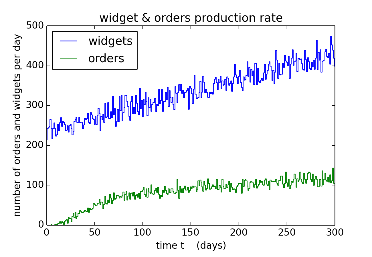
Monte Carlo modeling: here I used Monte Carlo modeling techniques to simulate a client's business. Again the details are confidential, so I will merely say that this this client manufactures `widgets' that he makes available for sale on his website. The model is written in Python, and the code plus some additional plots can be viewed in this ipython notebook, while the raw Python code is also available.
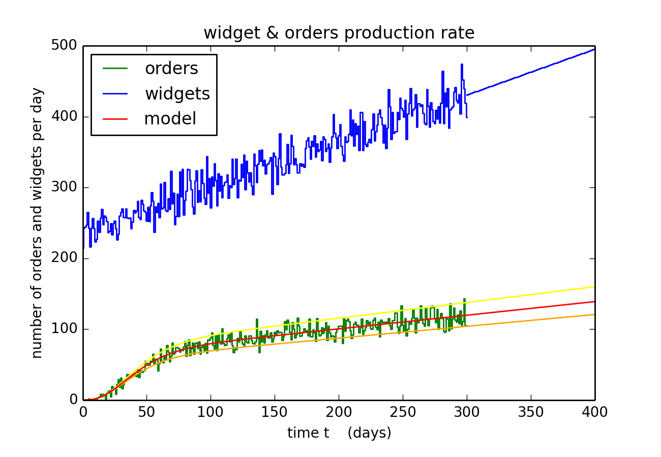
Model optimization: here I fit a model to my client's data on his product and the customer orders that they generate. That data is synthetic, it is the output from the Monte Carlo model described above. The goal here is to fit model to that data, which is then used to estimate the probability that any one customer actually purchases my client's product. That fit is also extrapolated into the future (see straight lines in above plot) and is used to predict future orders. This code also assesses the uncertainties in the predictive model's best fit, and further details are provided in the ipython notebook, or see the raw Python code.
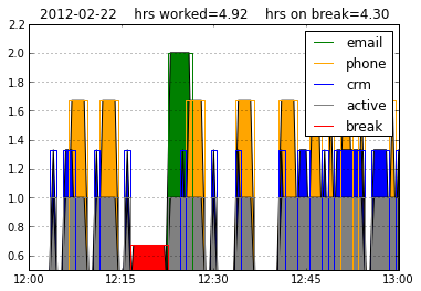
Legal support: This client was being sued by a former employee that was seeking additional compensation. The client provided logs of the employee's activities, namely the times when the employee was on the phone or emailing or other computer activities. I wrote the Python script that digested those logs and tabulated times spend working or not, and that code could also show graphically how the employee's time was allocated over any time segment (as illustrated by the above graphic). I do not know if the employee's complaint had any merits, or how the case was decided. But the client's lawyer did find my script to be quite useful.
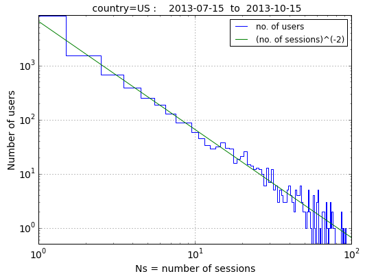
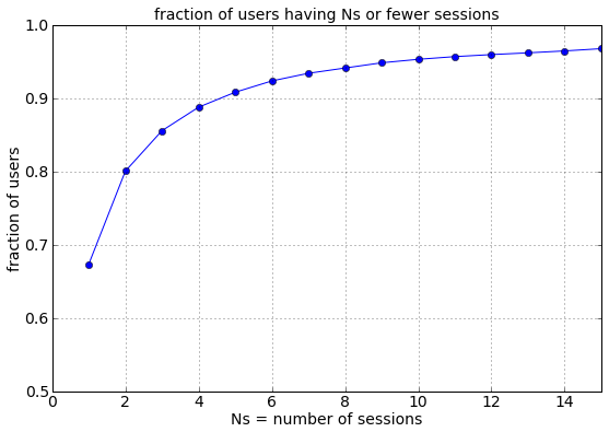
Web traffic: This client wanted to know the fraction of users that were one-time visitors to its website, versus the fraction that visited twice, thrice, etc. To answer this, I inspected the client's web traffic data and selected a random sample of 10,000 distinct visitors to the client's site, and the above plot (left, displayed on logarithmic axes) shows that most users of the website visited the site only once while ever-smaller numbers of users visited 2,3,4,etc times during the next three months. Right figure shows the cumulative distribution of visits, which tells us that 67% (two-thirds) of all users visit the client's website only once (and subsequently never again), and that only 5% of users use the client's site 10 or more times. This was an eye-opening result since the client had previously (and erroneously) believed that the fraction of repeat users was much higher.
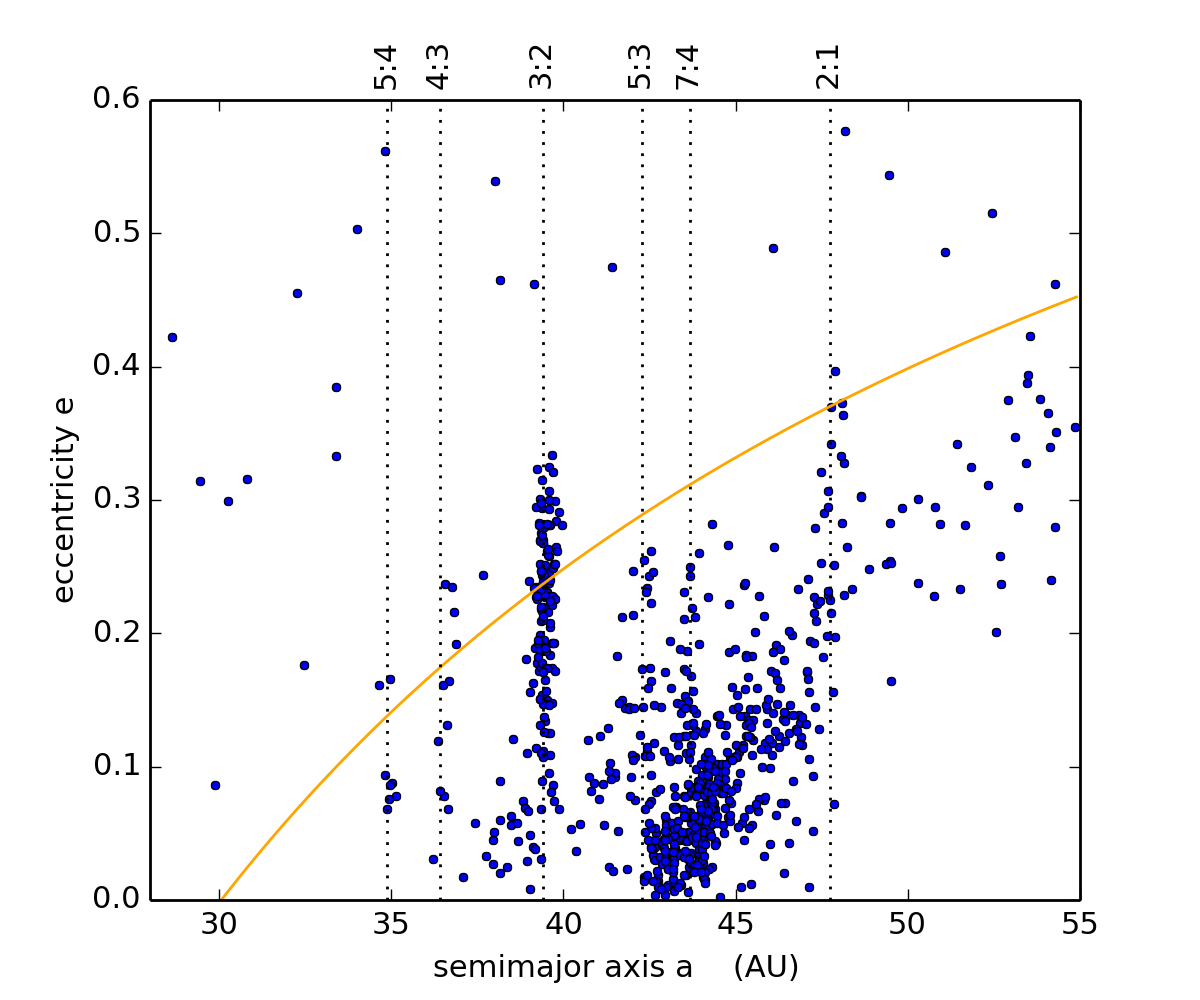
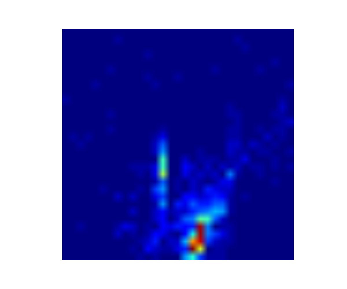
Heat map of the Kuiper Belt: Upper left plot shows the distribution of orbit elements for the 1000 or so known Kuiper Belt Objects (KBOs). The Kuiper Belt is the swarm of comets that orbit the Sun near and beyond Neptune's orbit, and the left figure shows each KBO's eccentricity e (which indicates how noncircular an orbit is) versus it's semimajor axis a (the object's average distance from the Sun). The heat map (above-right) shows the density of known KBOs across this orbit-element phase-space, and the observable KBOs are most dense in the Main Belt (red region) and high-e portion of Neptune's 3:2 resonance (vertical light-blue region). This heat map was created by these two Python codes, make_kbo_data_file.py and select_kbos.py, and that output is used by the SVM classification algorithm that is discussed below.
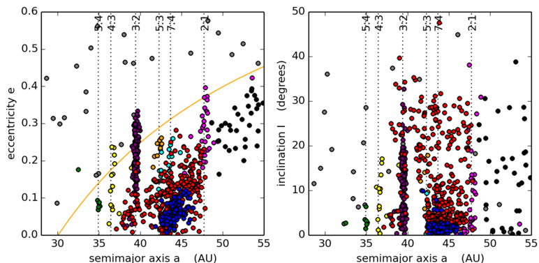
Support Vector Machine (SVM) classification: Here I select 15% of the above KBO population and manually classify each KBO's orbit [ie does the KBO inhabit the 2:1, 3:2, 4:3 etc resonances with Neptune, or in the scattered disk (which lies above the orange Neptune-crossing curve in the left figure) or in the hot/cold Main Belt (the red/blue KBOs that have high/low inclinations i), and so on]. Once the SVM algorithm is trained on the selected sample I then use the algorithm to classify the remaining 85% of the KBOs. As the above figure shows, the SVM classifier does a fairly good job of classifying the unknown KBO orbits, but the algorithm does make some errors. For instance it does not do a good job of separating the KBOs in close resonances, like the 5:3 and 7:4 And some of the hot (red) KBOs are mis-identified as cold (blue). Nonetheless this SVM classifier is still useful and classifies KBO orbits correctly 95% of the time. Details are kbo_svm.py, plot_kbo.py and the input data are in this python pickle file.
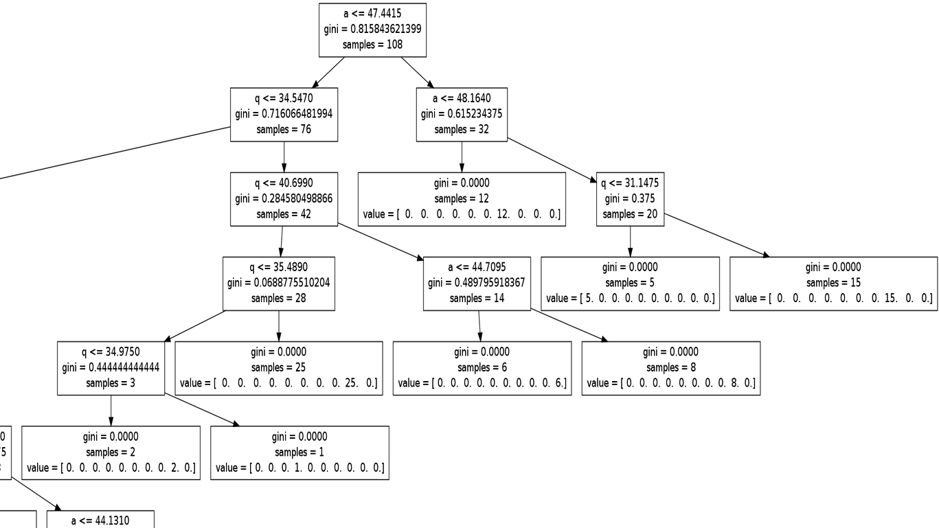
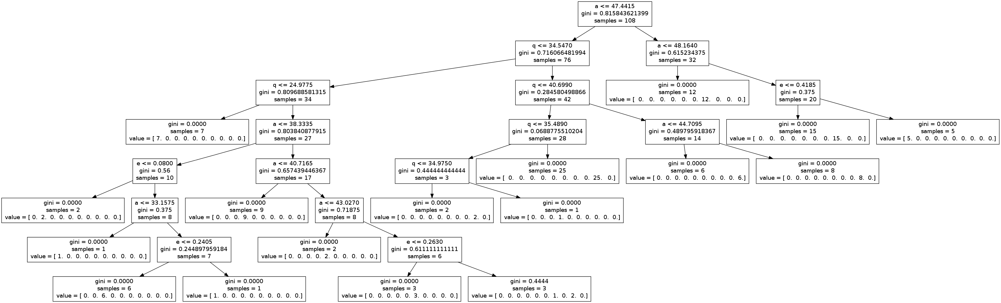
Decision trees: I also trained a decision tree classifier to classify the above KBO sample again; that algorithm was almost as successful as the SVM classifier, except the decision tree was unable to distinguish the hot and cold Main Belt populations. Despite that, one nice feature is that one can easily display the decision tree's classification logic via a flowchart, a portion of which is shown above (see kbo_dec_tree.png for the entire graphic). To illustrate how to read this flowchart, start at the topmost box which asks how many of the 108 KBOs in the training sample have semimajor axes a<47.4415 AU, of which 76 do (and they flow down along the left arrow) and 32 that don't (right arrow). Following the right/don't arrow shows that the decision tree then asks how many of those 32 KBOs also have a<48.164 AU, of which 12 do and they flow down the next left arrow to a terminal leaf in the decision tree, which assigned those 12 KBOs to the tree's 7th leaf (ie the 7th position in the 'value' array). This is the number of KBOS in the training sample that are members of the 3:2 resonance, and they all have semimajor axes of 47.4415 < a < 48.164 AU (see the purple KBOs just above the flowchart). See kbo_tree.py for the Python code that trains the decision tree and generates the flowchart.
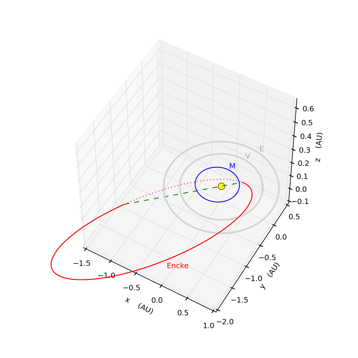
3D visualization: The above figure shows a perspective view of the inner Solar System, with the orbits of Mercury (blue) Earth and Venus (gray), as well as the orbit of comet Encke (red), which is eccentric (ie elongated) and also tilted about 10 degrees away from the planets' orbit plane. Comet Encke is also a very vigorous producer of dust, and notice how Encke's orbit comes very close to Mercury as it passes through the planets' orbital plane. And if Mercury does in fact intercept some of that comet's dust, then that planet likely experiences a meteor shower at this particular point in its orbit. And indeed that appears to be just what the Messenger spacecraft sees. Messenger has been orbiting Mercury and monitoring that planet since 2011, and once every Mercury year (four months), the abundance of refractory vapor (ie vaporized rock) in that planet's tenuous atmosphere doubles as the planet nears the comet's orbit; likely due to a meteor shower associated with comet Encke's dust tail. See kepler.py for the routines that calculate orbits and encke3d.py for the Python code that draws this 3D plot.
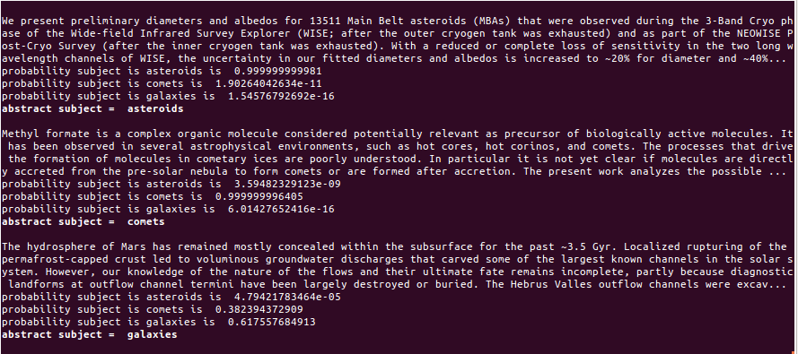
Baysian text classification: Here I train a naive-Bayes text classifier to classify the subject matter of scientific journal articles. This algorithm is trained on the abstracts (summary paragraphs) of 60 articles published in astronomy journals, and in this simple demonstration they are drawn from only from three subject areas: asteroids, comets, and galaxies. The above screenshot shows the output when the text classifier is then fed three new abstracts, one on comets and one on asteroids (both successfully identified), plus one more on Mars---to see what happens when the algorithm is asked to classify an abstract that it has not trained on. Fortunately the algorithm also reports its probability of success, so as the above graphic shows, it is easy to see when the classifier is confused and its results unreliable. See abstracts.py for the Python code that trains on these input files: asteroids.txt, comets.txt, and galaxies.txt.
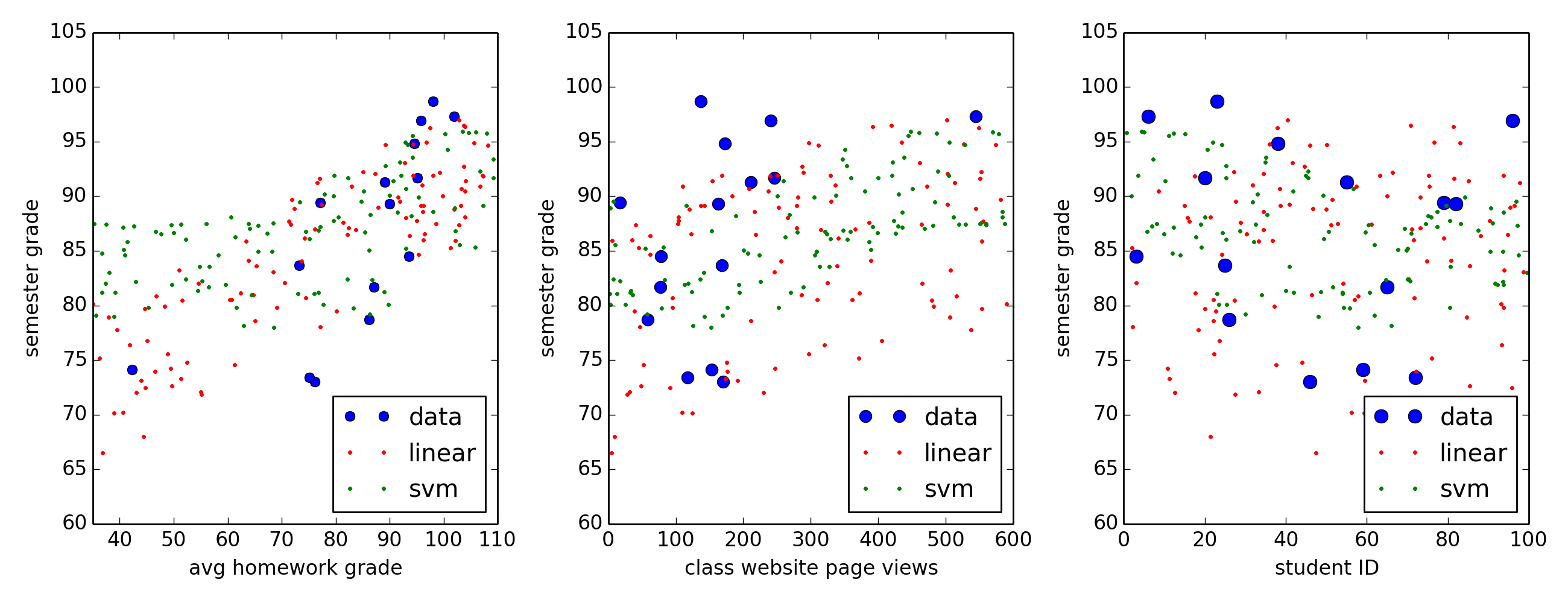
Linear regression: In this example, linear regression is used to fit a simple model to a rather small data sample, which are the grades that 15 students earned in a class I taught at the University of Texas. Blue dots in the above show the students' semester average plotted versus three of each student's 'features': the student's average grade on the homework (left plot), the number of times each student viewed the class website (where course materials were available for download, middle plot), and the student's semester average versus student ID number (right plot). One might expect that a student's semester grade would be rather sensitive to the student's success on the homework while being utterly insensitive to ID, and hopefully the software used here (Python's scikit-learn module) will confirm these expectations. A linear regression model is then trained on these data, and the red dots show the predicted grades when 100 randomly-generated students take my simulated class. The coefficients for this fit are 0.5, 0.3, and 0.1 which means that a simulated student's semester grade is most sensitive to the homework score (0.5), somewhat sensitive to the number of times the student views the class website (0.3), and only slightly sensitive to the student's ID (0.1). This particular fit also has a coefficient of determination R2=0.6 which means that 60% of data variations can be explained by this model; this indicates that the model provides an ok representation of the data but is definitely not a great fit. Green dots shows the predicted scores when an SVM algorithm is instead trained on this data, and though the SVM fit has an R2=0.8 it appears only marginally better than the linear regression fit. See class.py for the Python code that fits these models to the class grades.

mapping customer data: The client wanted a visual showing the company's top 20 revenue-generating cities and counties. This map was generated using Python's mpl_toolkits.basemap library, and the area of each dot is proportional to each site's revenue. The mapping code map_amount.py also calls upon Google maps to convert city,state names into longitude,latitude pairs. The input file records.csv contains each customer's location and input file orders.csv contains the purchase amounts (these input files are of course scrubbed of all confidential information). And to make things interesting, I use this simple Pig script records_orders.pig to read and join the two input files, and to group the data by city,state. Using Pig here is quite unnecessary because this dataset is so small, but it does illustrate how a simple Pig script can be used to scoop up data.